
Little Tokyo Country Club — Paid Social Ad Concept
Client: CRFT (Maki)
Project: Little Tokyo Country Club golf collection paid social concept
Role: Lead Designer (concept, art direction, layout, ad system)
Deliverables: IG/X paid social ad (primary), supporting variants (CTA + messaging), brand-aligned visual system
Overview
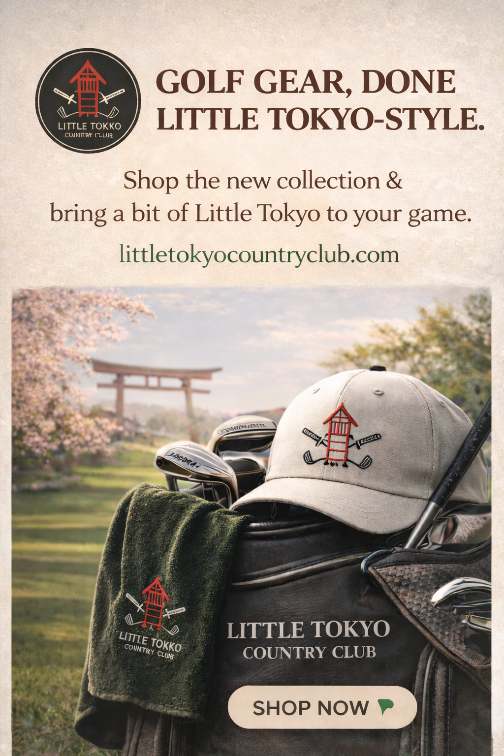
CRFT (via Maki) hired me to create a paid-social campaign concept for Little Tokyo Country Club—a golf apparel/gear brand with Japanese-inspired identity cues. The goal was to make an ad that felt premium and modern, while still carrying unmistakable Little Tokyo cultural signals.
The challenge
The ad needed to balance two worlds without feeling gimmicky:
Golf/lifestyle premium (clean, elevated, product-forward)
Little Tokyo identity (cultural references that feel respectful and intentional)
It also needed to work in a real paid environment:
readable on mobile
clear hierarchy
strong CTA
adaptable across placements (IG feed/story + X)
Creative strategy
I treated the campaign like a lifestyle drop:
Lead with product (hero image that feels aspirational)
Anchor with brand identity (logo + subtle cultural cues)
Make the message simple (one headline, one supporting line, one CTA)
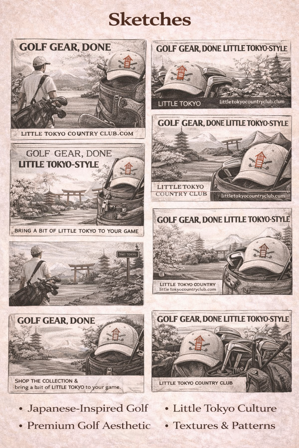
Sketching and ideation
I sketched multiple layout directions to test:
headline hierarchy (big statement vs. quieter luxury framing)
placement of logo + URL
product emphasis (hat/bag/ towel as hero objects)
CTA size and placement for mobile thumb reach
Goal of sketching: lock an ad layout that feels intentional and premium, not “template.”
Final design decisions
Hierarchy
Headline first (clear hook)
Short supporting line
URL for credibility
Product hero image
CTA button (high contrast, obvious action)
Look + feel
warm paper texture and neutral palette to keep it premium
minimal accents pulled from the identity (red mark)
cultural cues kept in the background/atmosphere so it stays tastefulWhat I’d improve next
If this campaign expanded, I’d build a full system around the hero:
icon set (lantern, torii, skyline, food cues)
secondary layouts (horizontal/vertical, story frames)
typography rules and color variants for different festival moments (parade, food night, performances)