Little Tokyo Nisei Week Festival Key Art
Client: CRFT (Maki)
Project: Little Tokyo Nisei Week Festival visual design / key art
Role: Lead Designer (concept, illustration direction, layout, production)
Deliverables: Festival key art (poster-style), social ad adaptations (IG/X), merchandise-ready artwork (tote/apparel), supporting graphic assets
Overview
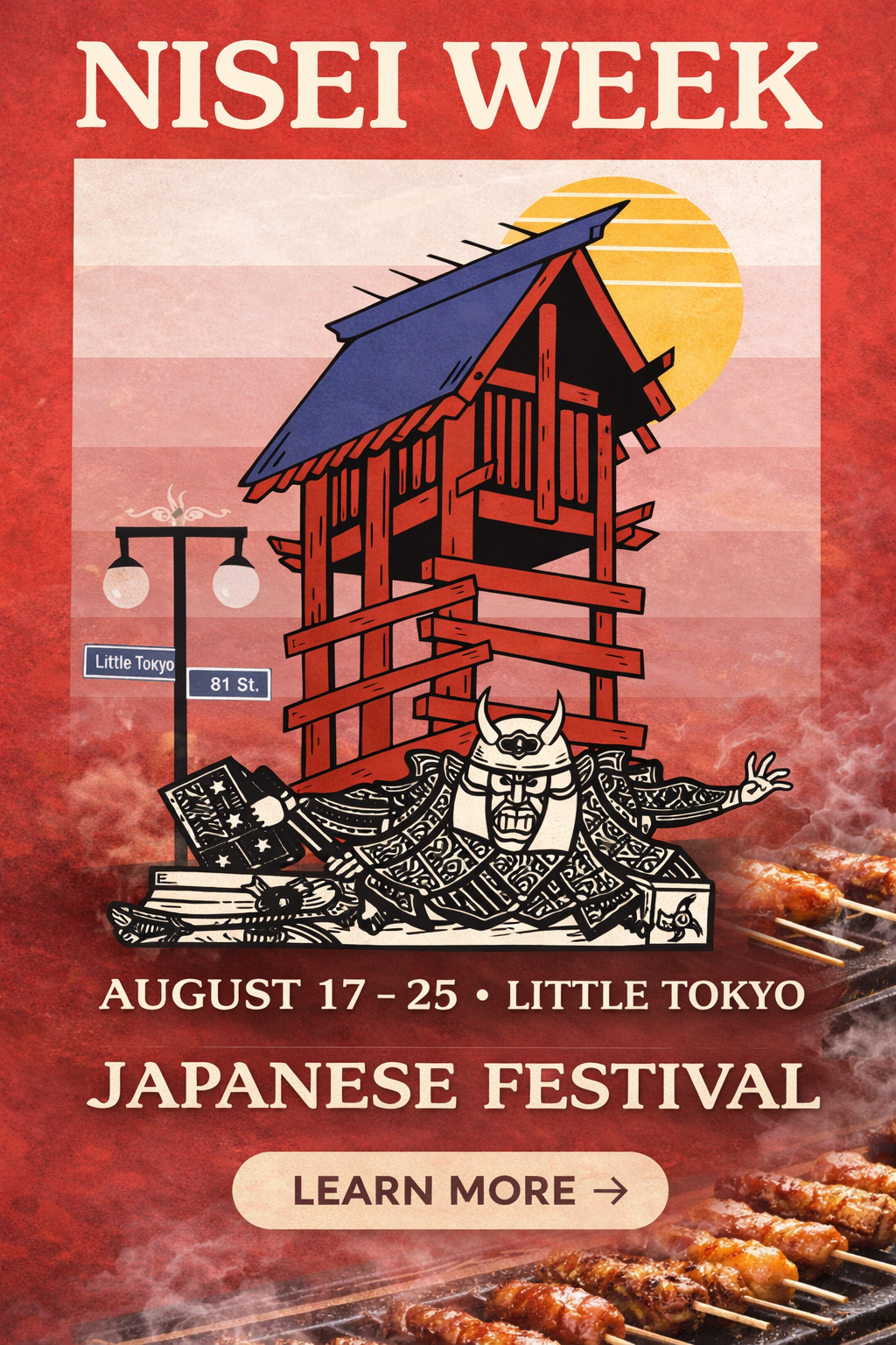
CRFT (via Maki) brought me on to create the main visual for the Little Tokyo Nisei Week Festival—a piece that could live across festival touchpoints (poster/social/merch) while still feeling culturally grounded, energetic, and iconic at a glance.
The goal was a design that felt bold and celebratory, but still respectful and rooted in Little Tokyo.
The challenge
Nisei Week is more than an event—it’s heritage, community, and tradition. The creative had to:
feel authentic to Little Tokyo
be instantly readable at a distance (poster + digital)
work as a hero graphic and also break down into reusable components
balance “festival energy” with cultural respect

Outcome
The final design delivered a recognizable, place-based visual that feels:
festival-forward and energetic
culturally inspired and respectful
flexible across poster, social, and merch applications
(If you have any real results—attendance, engagement, sales, usage across channels—drop them here. If not, keep it qualitative like above.)
What I’d improve next
If this campaign expanded, I’d build a full system around the hero:
icon set (lantern, torii, skyline, food cues)
secondary layouts (horizontal/vertical, story frames)
typography rules and color variants for different festival moments (parade, food night, performances)
Creative strategy
I focused on a single hero illustration that could carry the campaign across formats.
Core idea:
Build a “Little Tokyo” scene that feels like a vintage festival poster—layered, textured, and iconic—using recognizable elements that signal place and culture immediately.
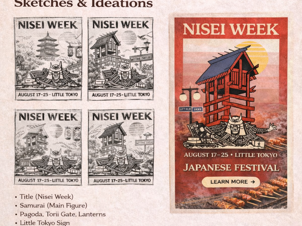
Sketching and ideation
I sketched multiple compositions to test:
Hierarchy (where the title and dates live)
What the hero element should be (tower/pagoda structure vs. other landmark cues)
Foreground character/figure for energy and storytelling (samurai motif)
Supporting details that communicate location (street sign) and festival atmosphere (lantern/food cues)