
Robb Report Ranking Social System
In-house social graphics system for recurring editorial features
Company: Robb Report
Role: Designer
Type: In-house social graphics system
Deliverables: Feature badges, cover slides, ranked carousel graphics, category variations
Overview
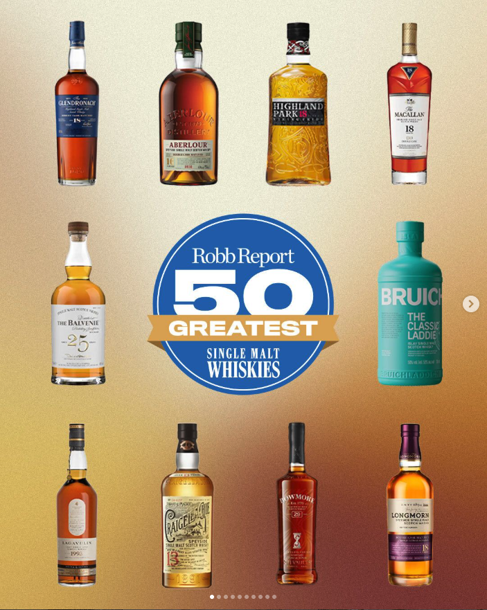
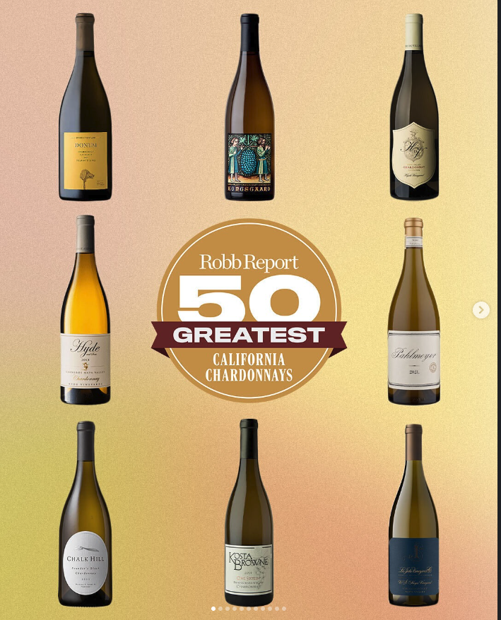
I created a series of social graphics for Robb Report’s recurring ranking features, built around a repeatable badge system that could scale across different editorial categories. The goal was to create assets that felt premium, recognizable, and easy for the editorial team to use across social while keeping the format consistent from one feature to the next.
The Challenge
The system needed to do a few things at once. It had to feel clearly tied to the Robb Report brand, work across very different subject matter, and stay readable in a social environment where attention is short and layouts need to work fast. It also had to support a carousel structure, with a strong lead image followed by ranked slides that could carry the story forward in a simple, repeatable way.
System Design
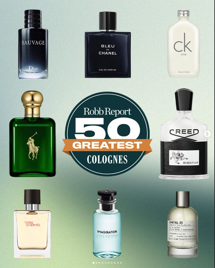
I built the graphics around a core badge structure that could adapt across categories while keeping the overall format recognizable. The badge acted as the anchor of the system, with color, category naming, and imagery shifting depending on the feature. This made it possible to create variety across editorial topics without losing consistency.
The intent was to keep the system flexible enough for different content types while still giving each ranking feature a clear visual identity of its own.
Live Application
These assets were used to support editorial rollouts across Robb Report social, giving the team a repeatable format for ranking-based stories.
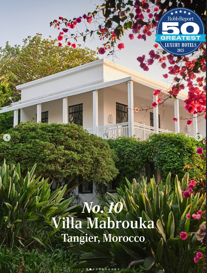
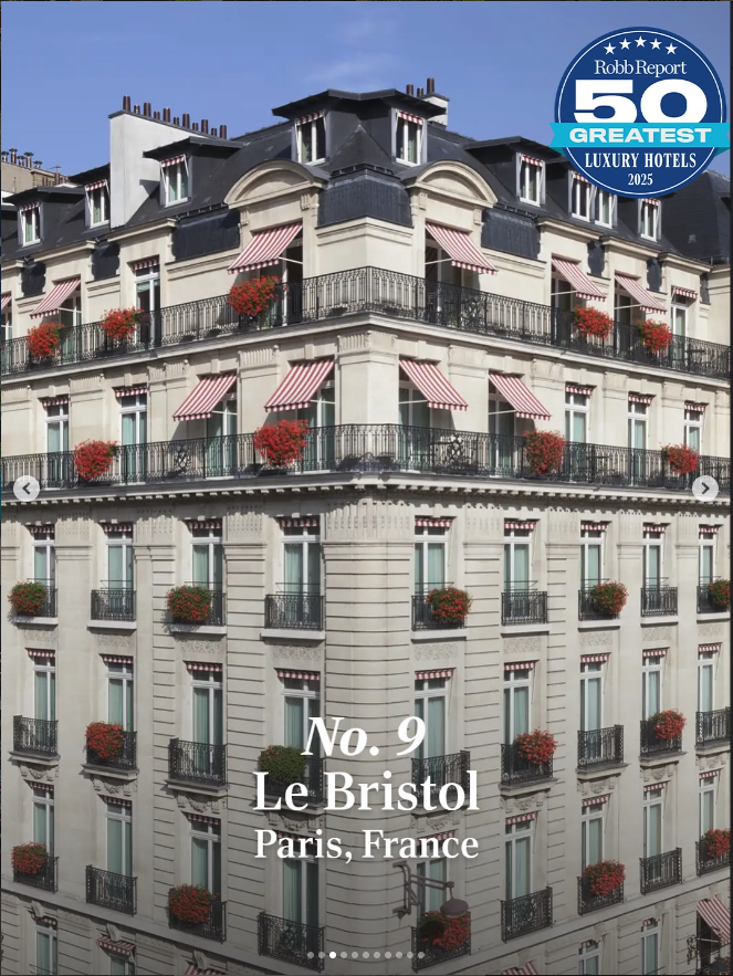
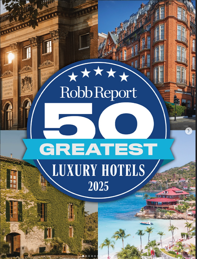
Hotels rollout
One of the strongest examples of the system in use was Robb Report’s 50 Greatest Luxury Hotels 2025 feature. The carousel opened with a branded cover slide, then moved into ranked selections that combined location imagery, badge placement, and clear type hierarchy.
The layouts were designed to hold up in-feed, keep the rankings easy to scan, and give the editorial team a straightforward format that could be repeated without feeling generic.
Design takeaways
This project was less about one-off social graphics and more about building a system that could scale. The work focused on repeatability, consistency, and making sure the visuals felt premium without becoming overly rigid.
It also reinforced something I care about in design: making work that looks strong, but is also practical for the team using it.