
🎌 Nisei Week 2023 T-Shirt Design
Honoring Tradition
Through Modern Design
Role: Lead Designer
Client: Nisei Week Foundation × CRFT by Maki
Scope: T-shirt design, cultural concept development, production collaboration
Tools: Adobe Illustrator, Photoshop
Project Overview
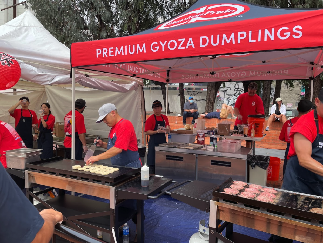
The Nisei Week Festival in Little Tokyo, Los Angeles, is a cultural cornerstone for the Japanese American community — celebrating heritage, art, and unity for over 80 years. The annual festival attracts thousands of attendees, from lifelong supporters to new generations discovering their roots.
The creative challenge: Design a commemorative T-shirt that honors the event’s deep traditions while resonating with a modern, multicultural audience. The design needed to be meaningful, visually striking, and wearable beyond the festival itself — a badge of pride for the community.

Design Strategy
The concept centered around connecting heritage and celebration — merging two powerful festival icons:
The Nebuta – a traditional Japanese float figure representing courage and protection.
The Yagura Tower – a symbolic centerpiece of Bon Odori festivals, embodying gathering and rhythm.
By combining these two elements in a single composition, the design captured both strength and togetherness — qualities at the heart of Nisei Week.

Design Thinking
Visual Hierarchy:
The Nebuta figure anchors the composition, positioned dynamically above the Yagura tower to symbolize protection and celebration. Surrounding wave and light motifs draw the eye upward, reinforcing motion and energy.
Color Psychology:
A limited palette of crimson red, indigo blue, and soft cream was used to reflect both Japanese tradition and contemporary streetwear appeal.
Red conveys energy and cultural pride.
Blue adds balance and calm.
Cream grounds the design and softens contrast for wearability.
Typography:
Custom-styled lettering inspired by Edo-period calligraphy was modernized with geometric proportions, bridging past and present. The secondary sans-serif adds clarity for the festival’s name and year, maintaining legibility in screen printing.
Cultural Symbolism:
The Nebuta reflects bravery and spirit — a nod to community resilience.
The Yagura anchors the design as a beacon for dance and gathering.
The wave patterns (Seigaiha) subtly represent continuity and harmony.
Medium & Constraints:
Because the shirts were screen-printed on both light and dark fabrics, the artwork was optimized for two-color printing, ensuring contrast, affordability, and consistency across sizes and base colors.
Collaboration
Working with CRFT by Maki, a community-driven apparel brand, I refined the artwork for print execution and coordinated color separations and placement mockups. This partnership ensured that the design not only looked great digitally but also translated beautifully to physical merchandise.
Applications
Festival T-Shirts — worn by performers, volunteers, and attendees.
Merch Booth & Marketing — featured in promotional materials, social posts, and storefront displays.
Archival Collectible — became a keepsake item for alumni and families, embodying nostalgia and pride.

Outcome & Impact
The design quickly sold out during the opening weekend of the festival.
It became one of the most photographed and shared shirts of the event, featured in community recaps and local press.
Festival organizers and attendees praised the balance of cultural authenticity and contemporary style, strengthening the event’s visual identity for future years.
Reflection
This project reaffirmed how design can preserve culture while keeping it alive in the modern era. By fusing heritage symbols with contemporary aesthetics, the Nisei Week T-shirt became more than apparel — it became a wearable celebration of identity, community, and belonging.